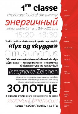
Iskra
Sans-serif typography doesn’t have to be cold and bland.
Created by my studio, Iskra is a vibrant sans-serif created for designers looking for a visual voice with poise and personality. Based on a low-contrast structure, Iskra (Russian for spark or flash) is a study of bridled energy in the Cyrillic and Latin scripts. Its eye-catching forms are a subtle tribute to the less-predictable style of brush lettering, and contain daring, elegant curves, economical proportions, open counters, and a slight top-heavy asymmetry. Iskra’s warmth comes from the subtle emphasis on the peculiarities of individual letterforms, whereas its stability results from its balanced rhythm and legibility over long spans of text.
Each font supports over 75 languages, including many languages of the Commonwealth of Independent States, and is hand-tuned for a pleasing legibility and aesthetic both in print and on screen. The family contains additional typographic refinements, among them tabular and proportional figures and currencies, ordinals, super- and subscript, ornaments, ligatures, and Cyrillic vowels accented for stress. This type family makes an excellent choice for presentations, articles, branding, and advertising.
Available in 14 fonts, Iskra represents a fresh, forward-looking perspective, melding style with savoir faire. It is available through TypeTogether.
The Type Directors Club judged Iskra a winner in their Type Design 2012 competition.
Share


